Supply Tracker App For Crafters

Case Study

Project Overview
This app aims to help small and mid-sized craft-selling businesses ensure they are always aware of what supplies they need by alerting users when they are running low, tracking statistics like rate of use and average number of updates, and allowing for quick and easy updates that automatically calculate how much of a supply still remains. This project's duration was about 8 weeks. As it was my first ever project, I spent most of the time experimenting with different visual tweaks.
My Contributions
This was my first UI/UX project ever, and I completed it for my Google Certification in UX Design. While it was overwhelming to dive into this new world, I was able to get experience in various different parts of a design project, including conducting research through surveying potential users  and completing competitive audits, as well as creating user personas, user journeys, wireframes, and mockups.

Here's what I ended up creating.

No more blindsides.

Always know what’s in your inventory. Always know when to reorder.

Frame for the onboarding screen of this supply tracking mobile app. It shows five tally marks over a background of various icons including a storefront, notebook, spreadsheet, pencil, ruler, and calculator. The text underneath reads, "Count on us. Easily update your supply inventory, and get reminders when you’re running low. We do the tracking, so you can do the making." A green button underneath reads, "Get started."
Frame for the dashboard of this supply tracking mobile app. The dashboard has widgets for the number of supplies, folder, products, and orders, as well as widgets underneath for statistics, items with no items, and items with low levels. Below are carousels for recently updated products and most updated products.

Just a glance.

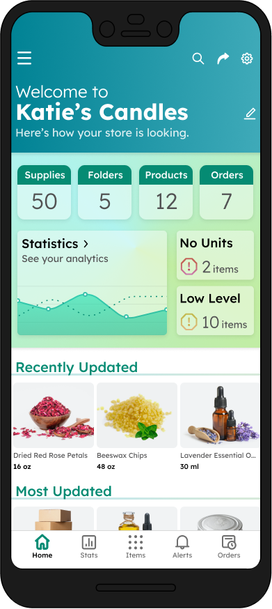
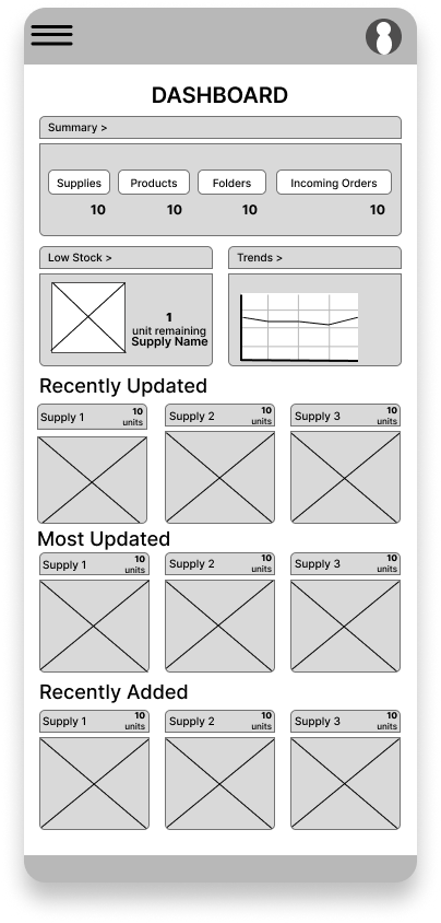
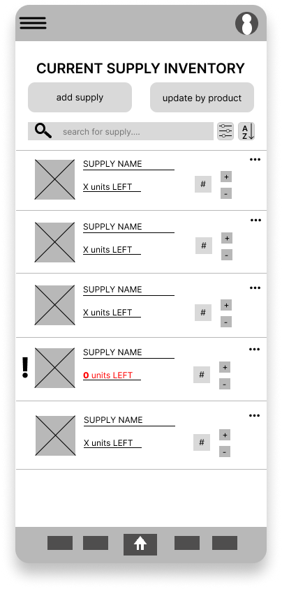
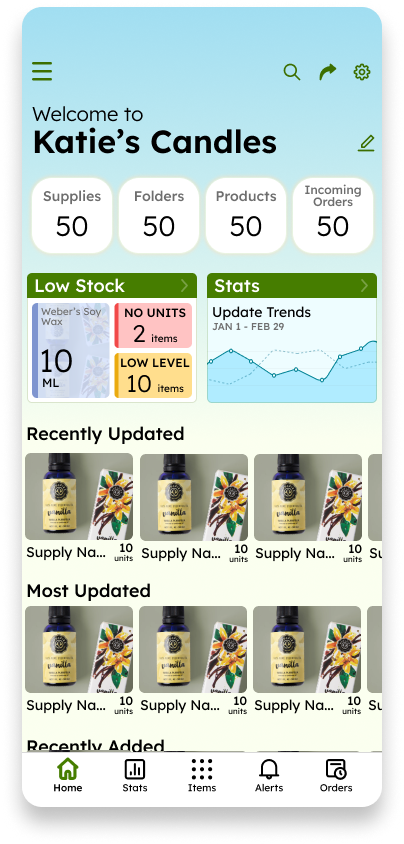
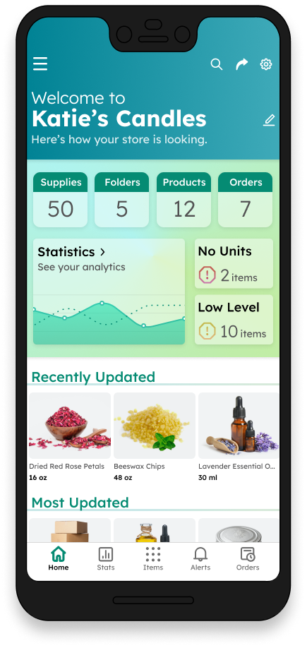
Quickly check everything you need to know most, right on your homepage.

Easily Organized.

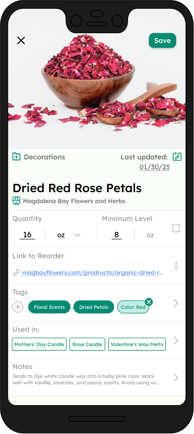
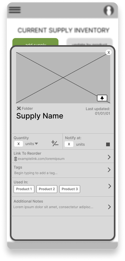
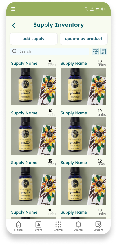
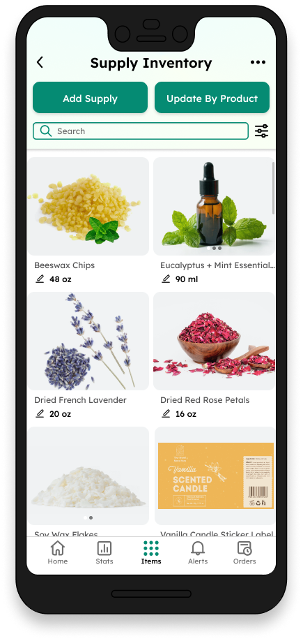
Keep a supply’s tags, folders, products, and reorder link all in one place.

Frame for the supply inventory for this supply tracking mobile app. Under the heading "Supply inventory" are two buttons for "Add Supply" and "Update by Product", as well as a search bar and a sort/filter button. Two columns show various candle making supplies with their labels and current amounts and units.
Frame for the "Add item" page for this supply tracker mobile app. It shows a photo of rose petals as the header. Small subheadings show "Decorations" folder and the date last updated being January 30, 2023.  The large title is labeled "Dried Red Rose Petals" and the store subheading is labeled "Magdalena Bay Flowers and Herbs." There are sections below for quantity, minimum level, link to reorder, tags, products the supply is used in, and notes.

Update Your Way.

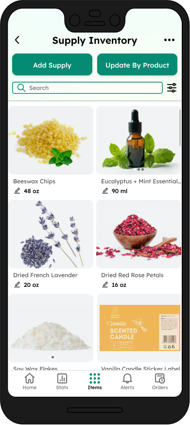
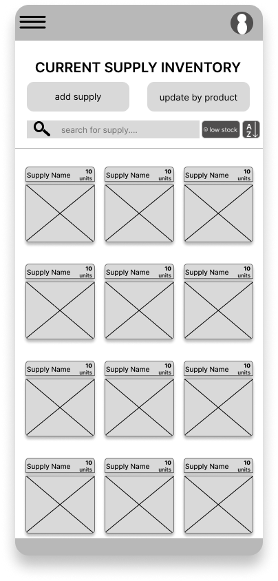
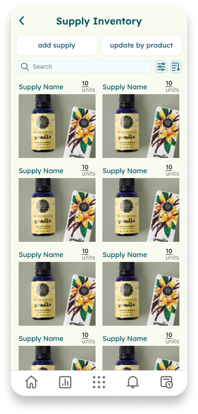
Update supplies manually, or multiple at once using “Update by Product”.

Stats for everything.

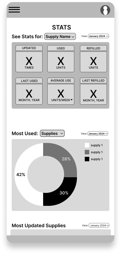
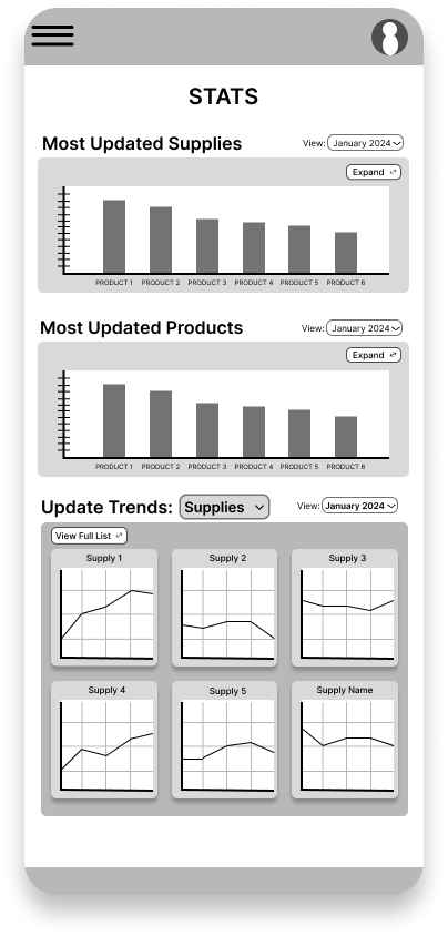
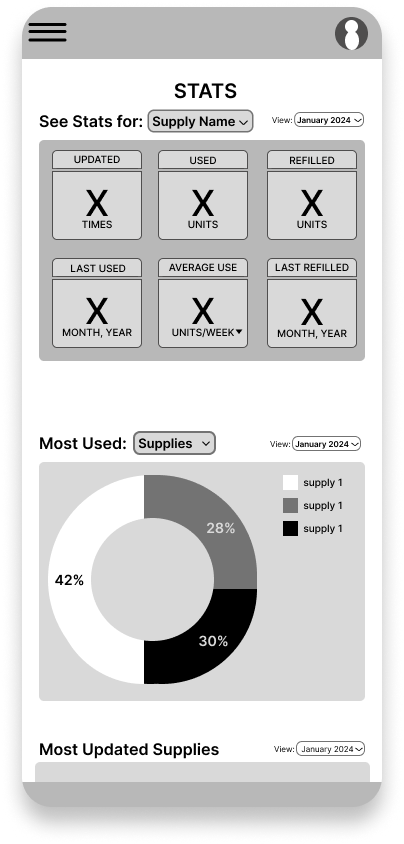
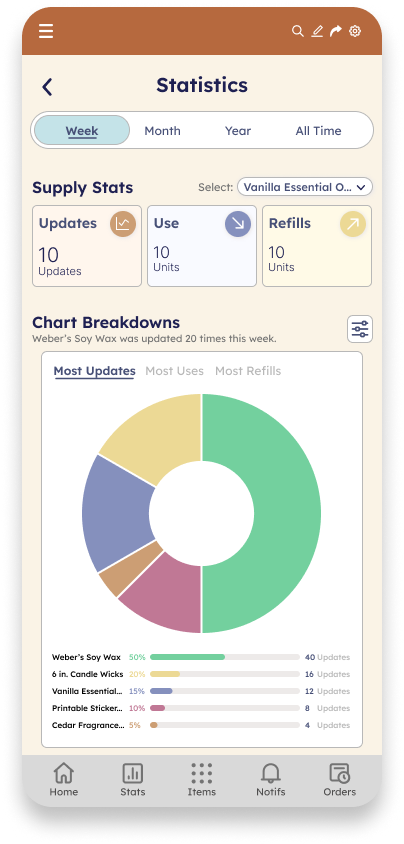
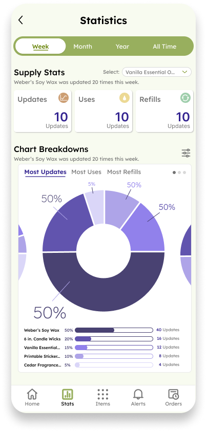
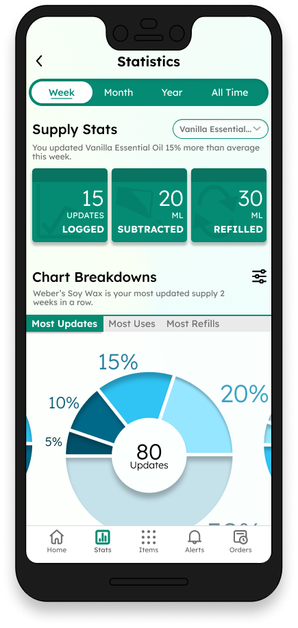
Look at your inventory through any time frame, any category, any way you need.

Frame for the "Statistics" page for this supply tracker mobile app. It has a toggle for the view period of week, month, year, or all time. Below shows Supply stats with a dropdown menu showing "Vanilla Essential Oil" selected, along with widgets for how many updates it has logged, how many milliliters have been subtracted, and how many milliliters have been added. The chart breakdowns section has a donut chart with views for  "most updates," "most uses," and "most refills."
Frame for the second half othe statistics section of the supply tracker mobile app. There is a toggle for week, month, year, or all time view, The chart breakdowns section, which has a donut chart with views for  "most updates," "most uses," and "most refills." The percentages are labeled on the chart, and below shows a legend for the items each percentage and section of the chart corresponds to.

Break it down.

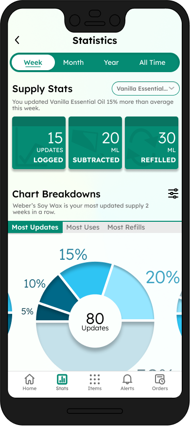
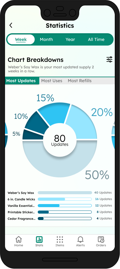
Check out which supplies you use least, what month you refill the most shipping boxes, and more.

Now, let's see how I got there.

User Research
Week 1
As the prompt "Create a mobile app that tracks supplies for candle makers" for this design project was generated for me by the course, I could jump straight into user research to determine pain points, which I did my creating a Google survey which I sent to 50 small candle businesses on Etsy and Instagram. From the 50, only 10% responded and filled out the form, so I expanded upon my research through looking at research for inventory apps and small business apps outside of just candle making.


Here are the major pain points I determined based off of my findings, as well as two of the personas I created alongside them.
A circle labeled "1".

The No-Supplies Surprise

A circle labeled "2".

Supplies in Abundance

A circle labeled "3".

Manual Calculations

A circle labeled "4".

Tracking Unsynced

It is all too easy to come to your workstation and see you’re out of something you really need. Users would be benefitted from knowing when to reorder.
In the inverse of point one, when reordering, it is easy to order too much of something that you do not end up using that much. Users should have a way to see an estimation of how much to refill.
Guessing at how much is remaining in the inventory or taking the time to calculate by hand quickly becomes inconvenient. This app should do the tedious work to allow users to focus on creating their products.
Inventory tracking gets confusing when your laptop’s spreadsheet has different information than your phone’s notes app. There should be a way to make sure a user has the same information accessible anywhere.
Persona: Phil. Problem statement:
Phil is a former firefighter, who has recently opened up his candle making business. He who needs a way to see what supplies he uses most and in what amounts, because he has a tendency to over-order supplies, costing him money he could have used elsewhere.
Phil's profile: Phil
Age: 58
Education: GED
Hometown:  Dearborn, MI
Family: Wife and 25 Year Old Daughter
Occupation: Small Business Owner.
Phil's quote: "I don’t have an easy way to conveniently track my supplies on my computer, so I just end up doing it by hand.”
 Goals:
Have a way to track that is simple, fast, and intuitive.
Have quick and accurate calculations what he has remaining.
Have a way to track what is used monthly.
Frustrations:
Easy to overorder supplies.
Online trackers are more confusing than just tracking by hand.
Possibility for mistakes when calculating by hand.
Persona: Parvati.
Problem statement:
Parvati is a busy college student who sells candles as a supplemental income. Now that they live in a larger city, they are often on-the-go, so they need a way to sync their supply management across platforms so Parvati can trust that they have consistent data whether they are out shopping for supplies or working at home.
Parvati's profile: Parvati
Age: 19
Education: Currently pursuing B.A. in Literature
Hometown: Dayton, OH
Family: Mother, Father, and 2 older sisters.
Occupation: College Student.
Parvati's quote: “It’s annoying to make sure my phone notes match my spreadsheets, and make sure both actually match my supplies.”
Goals:
Have consistent data across all platforms.
Track incoming shipments of supplies easily.
Have a method of tracking that is organized and is easily updated from anywhere.
 Frustrations:
Tracking inventory across different apps and notes leads to inconsistent numbers.
Easy to forget attributes like links to shop when tracking manually.
Tedious to reorder supplies from various sites/apps.
Wireframing
Week 1
With my notes from my survey results, user personas, user journey maps, and competitive audits, I began to outline features of the app I wanted to create along with starting to outline the information architecture. I wanted to build a dashboard that gave an overview of useful information, like number of incoming refills or number of supplies, as well as giving quick access to updating the recently/most commonly used supplies, and widgets that would lead the user to pages like the statistics page or the inventory page filtered to show items with low levels.

Here are some of the digital wireframes created for my initial designs.  
Wireframe for the dashboard of this supply tracking mobile app. The summary widget shows the number of supplies, folder, products, and orders, as well as widgets underneath for statistics and items with low levels. Below are carousels for recently updated products, most updated products, and recently added products.
Wireframe for the current supply inventory of this supply tracking mobile app. It includes "add supply" and "update by product" buttons, as well as a search bar. Below are individual rows of a product with a small photo, the supply name, and units left. The right side shows the number of units and plus and minus buttons.
Wireframe for the supply inventory for this supply tracking mobile app. Under the heading "Current Supply inventory" are two buttons for "Add Supply" and "Update by Product", as well as a search bar and a sort/filter button. Three columns show various candle making supplies with their labels and current amounts and units.
Wireframe for the "Add item" page for this supply tracker mobile app. It shows a place for a photo as the header. A small subheading shows the date last updated being January first, 2001.  The large title is labeled "Supply Name." There are sections below for quantity, minimum level, link to reorder, tags, products the supply is used in, and notes.
Wireframe for the "Statistics" page for this supply tracker mobile app. It has a dropdown menu to select the supply you want to see stats for, as well as one for the view currently selected as January 2024. There is an array of 6 widgets showing how many times the supply was updated, how many units it was used and refilled, the dates of the last use and refill, and the average use per week. There is a donut chart for most used, with the drop down menu selecting the most used supplies view.
Wireframe for the "Statistics" page for this supply tracker mobile app. It has bar charts for the most used supplies and the most updated products. There is an array of 6 line graphs showing the update trends of various supplies.
Design
Week 2-5
Though this was my first dive into UI/UX, I was rather unhappy with how some of my initial designs were panning out, so the remainder of the project was spent experimenting with layouts and designs, trying new ideas, and getting feedback from other beginner designers on Discord and Tumblr, as well as friends who know nothing about user experience. I worked hard on trying to improve as quickly as possible.


Here are how my designs evolved over the course of a few weeks.

Dashboard Evolution

Wireframe for the dashboard of this supply tracking mobile app. The summary widget shows the number of supplies, folder, products, and orders, as well as widgets underneath for statistics and items with low levels. Below are carousels for recently updated products, most updated products, and recently added products.
First iteration for the dashboard of this supply tracking mobile app. The summary widget shows the number of supplies, folder, products, and orders, as well as widgets underneath for statistics and items with low levels. Below are carousels for recently updated products, most updated products, and recently added products. It has a color palette of navy blue, teal, and pastel blue.
This dashboard has the same components as the wireframe and first iteration, but a gradient background has been added, the color palette had been modified to include some  light oranges, and the font has changes.
Third iteration of the dashboard design. The background is now a pastel blue and mint green. There are individual widgets for supplies, folders, products, and incoming orders. The statistics widget has been modified to show a line graph design. The supplies in the below carousels are not outlined on a background.
Frame for the dashboard of this supply tracking mobile app. The dashboard has widgets for the number of supplies, folder, products, and orders, as well as widgets underneath for statistics, items with no items, and items with low levels. Below are carousels for recently updated products and most updated products.

Supply Inventory Evolution

Wireframe for the current supply inventory of this supply tracking mobile app. It includes "add supply" and "update by product" buttons, as well as a search bar. Below are individual rows of a product with a small photo, the supply name, and units left. Each photo has exclamation point beside it.  The right side shows the number of units and plus and minus buttons.
Wireframe for the supply inventory for this supply tracking mobile app. Under the heading "Current Supply inventory" are two buttons for "Add Supply" and "Update by Product", as well as a search bar and a sort/filter button. Three columns show various candle making supplies with their labels and current amounts and units.
First iteration for the supply inventory for this supply tracking mobile app. Under the heading "Current Supply inventory" are two buttons for "Add Supply" and "Update by Product", as well as a search bar and a sort/filter button. Three columns show various candle making supplies with their labels and current amounts and units. The color scheme includes light green and teal.
The second iteration is identical to the first, with the exception of the green header with a drop menu and various icons were previously included.
Frame for the supply inventory for this supply tracking mobile app. Under the heading "Supply inventory" are two buttons for "Add Supply" and "Update by Product", as well as a search bar and a sort/filter button. Two columns show various candle making supplies with their labels and current amounts and units.

Statistics Evolution

Wireframe for the "Statistics" page for this supply tracker mobile app. It has bar charts for the most used supplies and the most updated products. There is an array of 6 line graphs showing the update trends of various supplies.
Wireframe for the "Statistics" page for this supply tracker mobile app. It has a dropdown menu to select the supply you want to see stats for, as well as one for the view currently selected as January 2024. There is an array of 6 widgets showing how many times the supply was updated, how many units it was used and refilled, the dates of the last use and refill, and the average use per week. There is a donut chart for most used, with the drop down menu selecting the most used supplies view.
First iteration of the "Statistics" page for this supply tracker mobile app. It has a toggle for the view period of week, month, year, or all time. Below shows Supply stats with a dropdown menu showing "Vanilla Essential Oil" selected, along with widgets for how many updates it has logged, how many units have been subtracted, and how many units have been added. The chart breakdowns section has a donut chart with views for  "most updates," "most uses," and "most refills." The color palette includes orange and peach.
The second iteration is similar to the first. The color palette has been changed to greens, and for the donut chart, the color palette is purple. The header has also been removed.
Frame for the "Statistics" page for this supply tracker mobile app. It has a toggle for the view period of week, month, year, or all time. Below shows Supply stats with a dropdown menu showing "Vanilla Essential Oil" selected, along with widgets for how many updates it has logged, how many milliliters have been subtracted, and how many milliliters have been added. The chart breakdowns section has a donut chart with views for  "most updates," "most uses," and "most refills."
Result
Week 5
After several iterations, lots of UI/UX research, and the feedback from almost everyone around me, I settled on a design for this project.

Here are the final pages all together.
Frame for the onboarding screen of this supply tracking mobile app. It shows five tally marks over a background of various icons including a storefront, notebook, spreadsheet, pencil, ruler, and calculator. The text underneath reads, "Count on us. Easily update your supply inventory, and get reminders when you’re running low. We do the tracking, so you can do the making." A green button underneath reads, "Get started."
Frame for the dashboard of this supply tracking mobile app. The dashboard has widgets for the number of supplies, folder, products, and orders, as well as widgets underneath for statistics, items with no items, and items with low levels. Below are carousels for recently updated products and most updated products.
Frame for the supply inventory for this supply tracking mobile app. Under the heading "Supply inventory" are two buttons for "Add Supply" and "Update by Product", as well as a search bar and a sort/filter button. Two columns show various candle making supplies with their labels and current amounts and units.
Frame for the "Add item" page for this supply tracker mobile app. It shows a photo of rose petals as the header. Small subheadings show "Decorations" folder and the date last updated being January 30, 2023.  The large title is labeled "Dried Red Rose Petals" and the store subheading is labeled "Magdalena Bay Flowers and Herbs." There are sections below for quantity, minimum level, link to reorder, tags, products the supply is used in, and notes.
Frame for the "Statistics" page for this supply tracker mobile app. It has a toggle for the view period of week, month, year, or all time. Below shows Supply stats with a dropdown menu showing "Vanilla Essential Oil" selected, along with widgets for how many updates it has logged, how many milliliters have been subtracted, and how many milliliters have been added. The chart breakdowns section has a donut chart with views for  "most updates," "most uses," and "most refills."
Frame for the second half othe statistics section of the supply tracker mobile app. There is a toggle for week, month, year, or all time view, The chart breakdowns section, which has a donut chart with views for  "most updates," "most uses," and "most refills." The percentages are labeled on the chart, and below shows a legend for the items each percentage and section of the chart corresponds to.

I hope you enjoyed looking at my first project. I'm excited to continue learning and designing to bring better and better designs every time.

Thank you!